SAKSHI

Profile Photo

SAKSHI SONWANE

UI/UX Designer || Frontend Developer

Designing interfaces that are clear, usable, and thoughtful.

HELLO
Hello
I'm Sakshi, a UI/UX designer who's curious about how people actually use digital products, not just how they look. I pay attention to the small decisions that shape an experience, from layout and spacing to how an interaction feels in the moment.
SKILLS
Skills
PROJECTS
Projects

REAL ESTATE WEBSITE

The Challenge

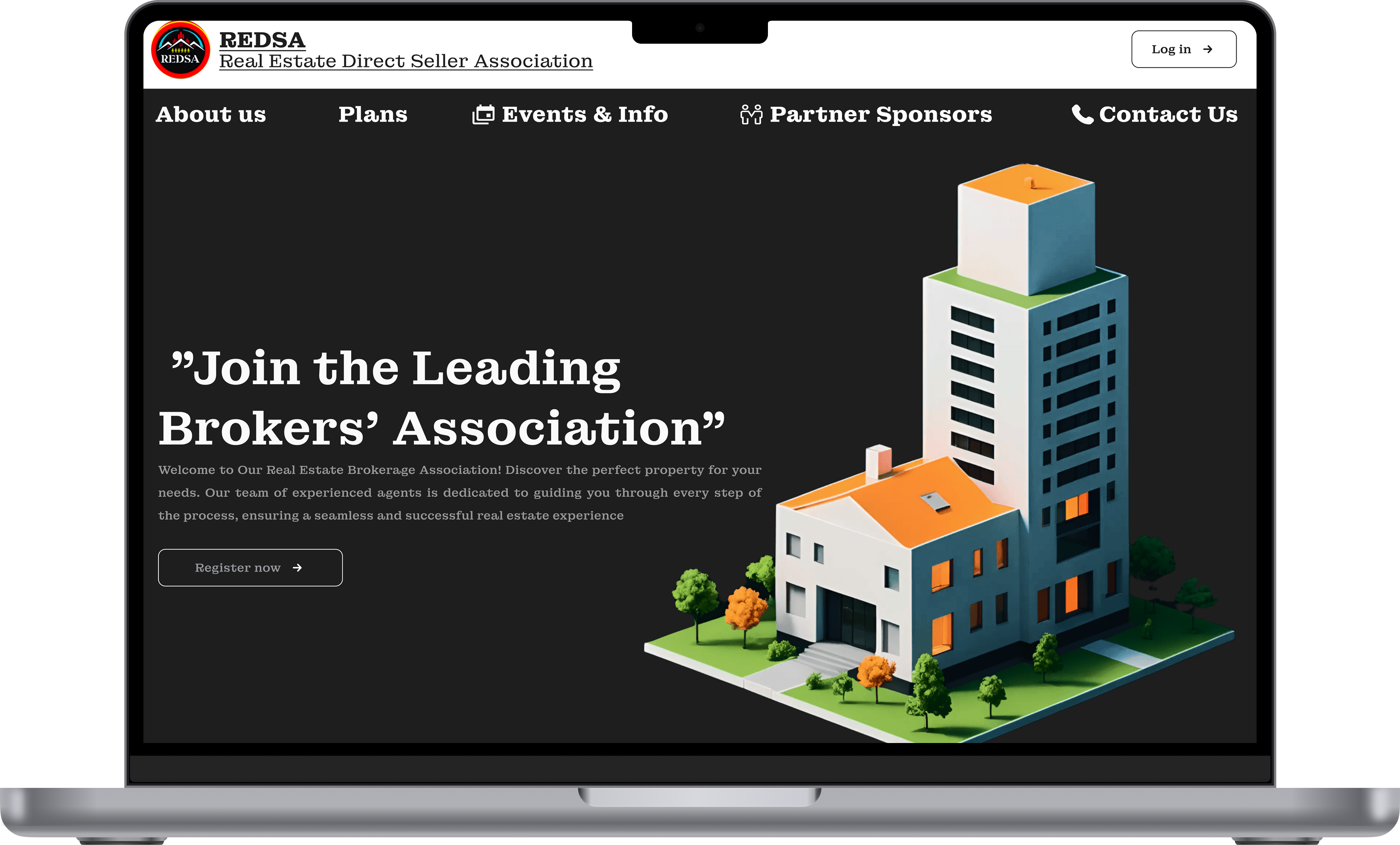
Real estate platforms often suffer from visual overload — too many listings, cluttered filters, and inconsistent hierarchy. The challenge was to design an interface that felt premium and editorial while remaining highly functional for users actively searching for a home or investment property.


Design Approach

  • Every screen focuses on a single primary action to reduce cognitive load.
  • Navigation, filters, and CTAs were kept minimal and intentional.
  • Typography, whitespace, and color were used to build visual credibility.
  • Design reflects the high-stakes nature of real estate decision-making.
  • A clean hierarchy ensures users move through the experience naturally and confidently.

JUCIFY MOBILE APP

The Challenge

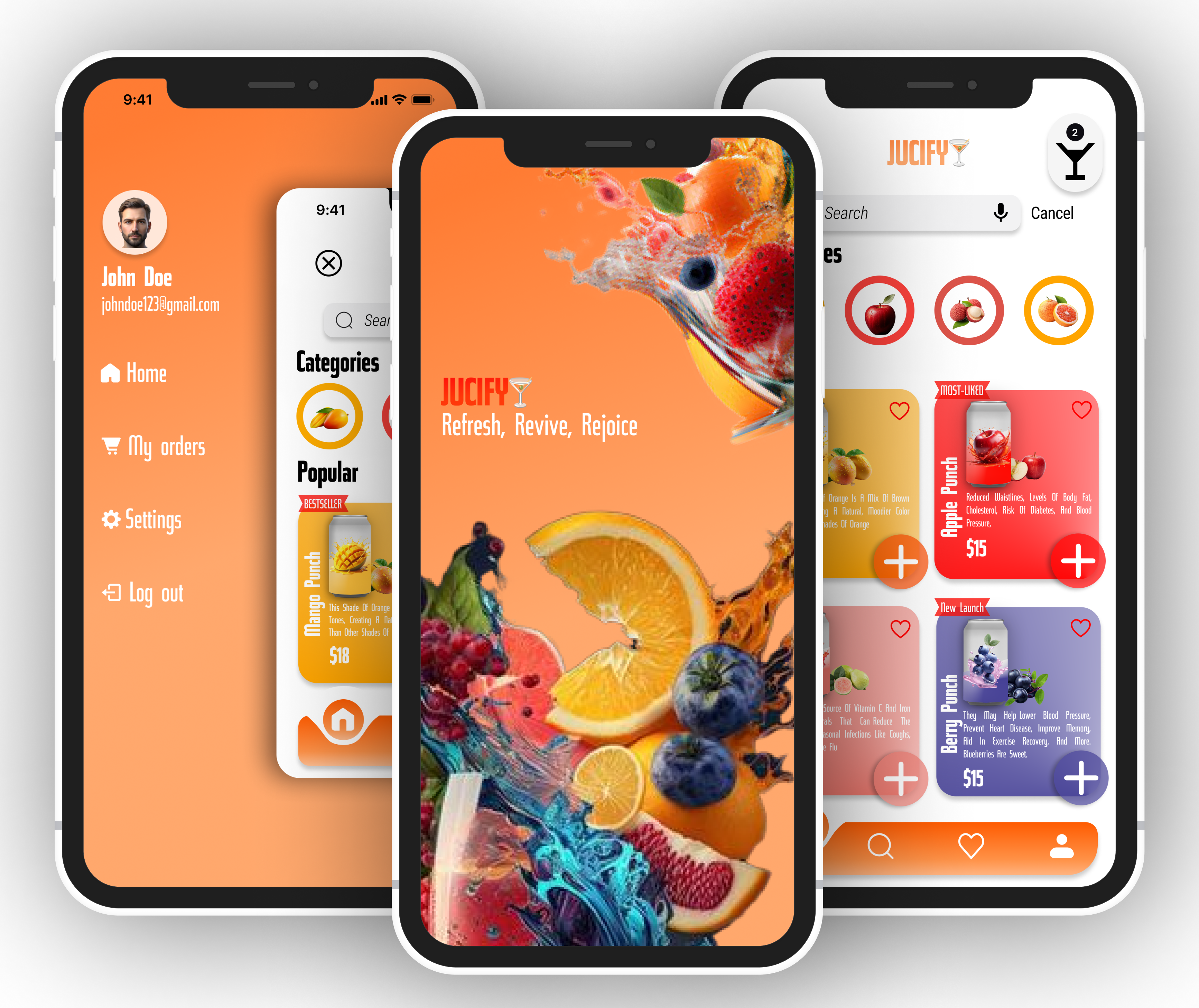
class="text-justify max-w-full"> Food and beverage apps live or die on visual appeal. The challenge was to design an experience that felt energetic and fun without sacrificing usability — keeping the order flow simple while letting the product visuals do the talking.

Design Approach

  • Color as communication — a bold, fruit-inspired palette was used to create instant visual energy and brand personality.
  • Minimal tap-to-order flow — reduced the steps between discovery and checkout to keep momentum high.
  • Visual-first layout — large imagery and clean card components put the product front and center.
  • Design reflects the high-stakes nature of real estate decision-making.
  • Playful yet structured — typography and spacing balanced energy with readability.
Oncology Website Mockup

ONCOLOGY EXCELLENCE CENTER LANDING PAGE

The Challenge

Healthcare design carries significant responsibility. Users visiting an oncology center's website are often anxious and seeking reassurance. The design needed to feel calm, credible, and compassionate — while still being easy to navigate under emotional stress.

Design Approach

  • Soft color palette and calming visual hierarchy to reduce anxiety.
  • Clear navigation and structured information for quick access to services.
  • Large typography and whitespace to improve readability.
  • Trust-building elements like doctor profiles and testimonials.
  • Clear call-to-action for appointment booking and consultation.
Oncology Website Mockup

FASHION FUSION SHOPPING WEBSITE

The Challenge

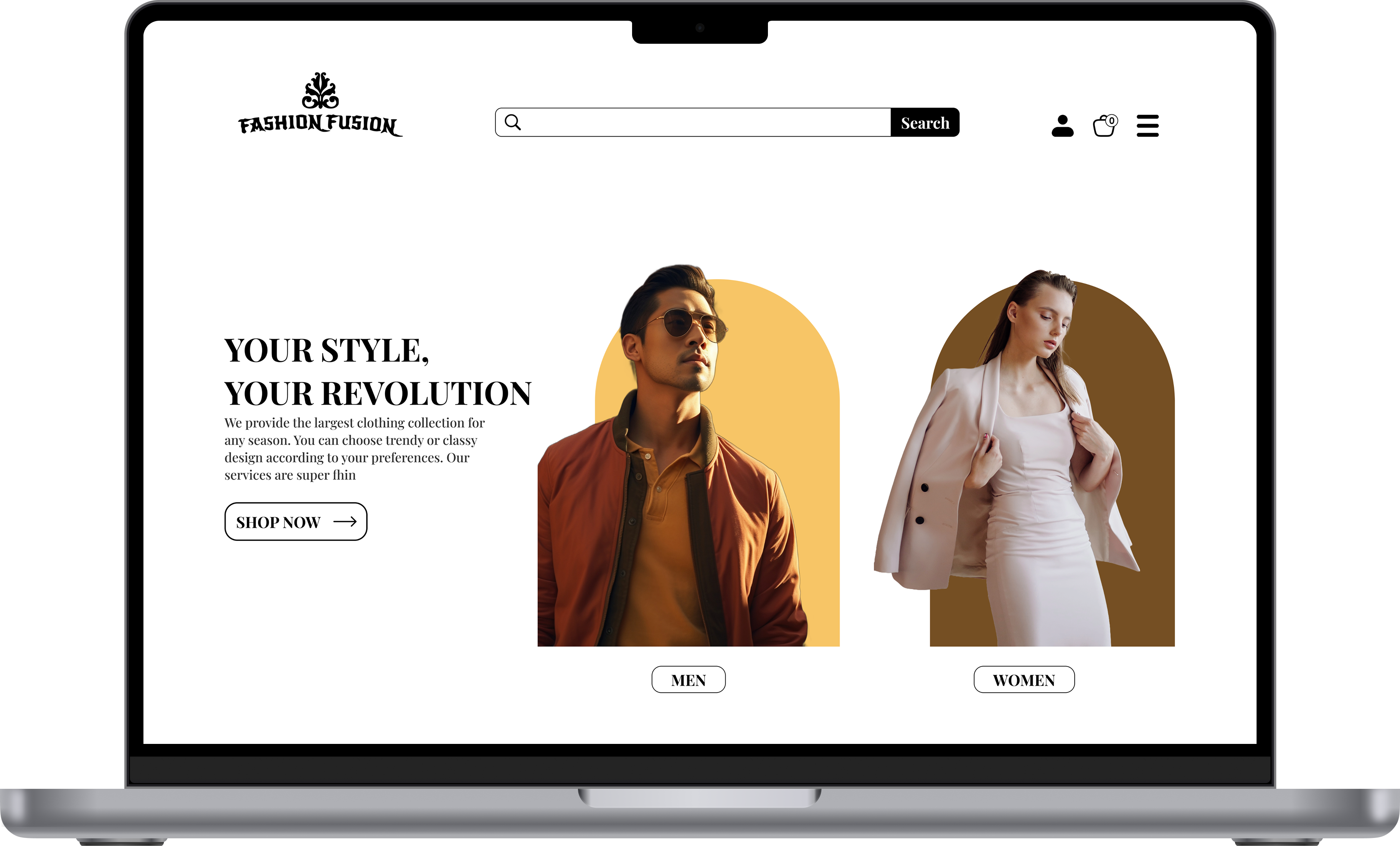
E-commerce interfaces are highly competitive. Users expect speed, clarity, and zero friction. The challenge was to design a shopping experience that felt polished and trustworthy while keeping the path from browsing to purchase as short as possible.

Design Approach

  • Conversion-led layout — every page was designed with a clear next action, reducing drop-off at each stage of the funnel.
  • Consistent product card system — a scalable card design ensured visual consistency across categories and grid sizes.
  • Frictionless checkout thinking — form layout and CTA placement were designed to minimize abandonment.
  • Clean, neutral aesthetic — the visual style kept focus on the products rather than the interface itselfs.
EDUCATION
Education
EXPERIENCE
Experience